Fragmented experiences are confusing, overwhelming, and notoriously user-unfriendly. But that’s exactly the kind of chaos I love simplifying. If we don’t fix this, Web3 won’t scale. Chain abstraction is a game-changer, allowing users to interact across chains without needing to understand what’s happening under the hood. My goal was to take this invisible complexity and translate it into an experience that felt smooth, safe, and almost boring. In a good way.
My roles
UX Design
UI Design


Benchmarking analysis
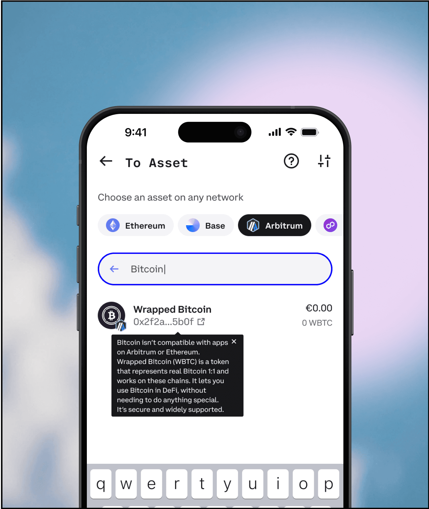
I began with a benchmarking analysis of cross-chain wallets like Coinbase, Phantom, Bitget, and THORWallet. Each had their own approach to swaps, and while some nailed onboarding, others stumbled over clarity, flow, or gas management. I mapped common UX pitfalls and used those as my north star for improvement.
To support the UI, I built a flexible design system that worked across light and dark modes. Tokens for color, spacing, border radius, and typography ensured visual consistency while maintaining the flexibility needed for responsiveness. Each screen in the flow was constructed with AutoLayout and fluid spacing logic to stay consistent across different screen sizes and breakpoints.


Trust & Visual Feedback
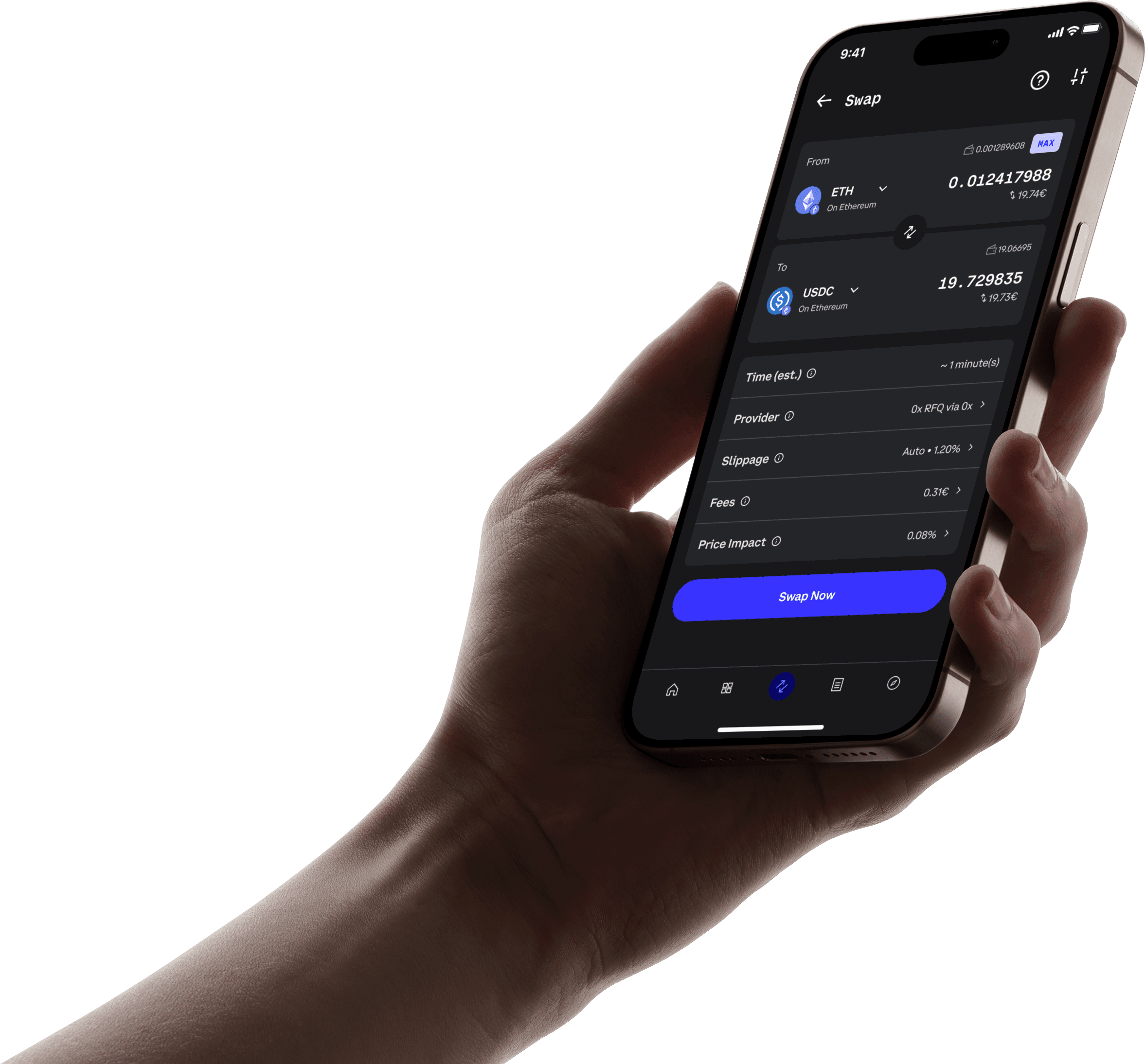
Since poor UX paired with low trust can kill adoption, I leaned into familiarity. Inspired by online banking, the design emphasized consistency and clarity. Terminology remained stable throughout (always “Swap,” never “Convert”), and visual patterns repeated where possible to create a sense of safety and predictability.
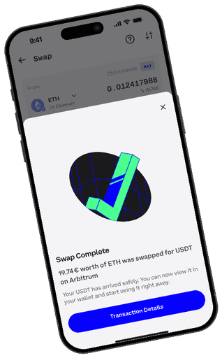
After users confirmed a transaction, I introduced a lightweight Rive animation to provide visual feedback during the swap. Web3 transactions can’t be undone, and that final moment of waiting can trigger anxiety. This animation created a buffer of reassurance. Clear, smooth, and calming. Letting users know their assets were en route without staring at a loading spinner in existential dread.

P
L
U
T
O


DARK THEME
Dark theme is very popular, so it was a natural next step for me to add it as well. I led both Interaction and Visual Design for this project. The key challenge? The product's vibrant color scheme could lead to increased eye strain in low-light conditions.